About RADKIN
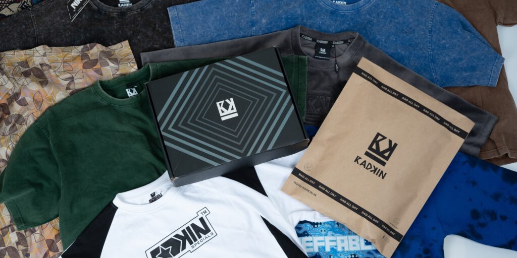
At Radkin, we believe in living rad all day , everyday. We’re dedicated to sustainability and ethical craftsmanship, sourcing materials responsibly and ensuring every piece reflects our commitment to quality and the environment. Radkin is about embracing your style with pride and standing out with confidence in every moment.
Whether you’re an adventurer, a trendsetter, or someone who values authenticity, Radkin designs with you in mind. Join our kin, redefine modern fashion with pieces that speak volumes about who you are and who you aspire to be.
“RAD ALL DAY” is our motto that exudes a sense of enthusiasm and positivity , capturing a lifestyle centered around being cool , upbeat , and enjoying life to the fullest.
We’re here to shake up your wardrobe with our killer designs And impeccable quality.
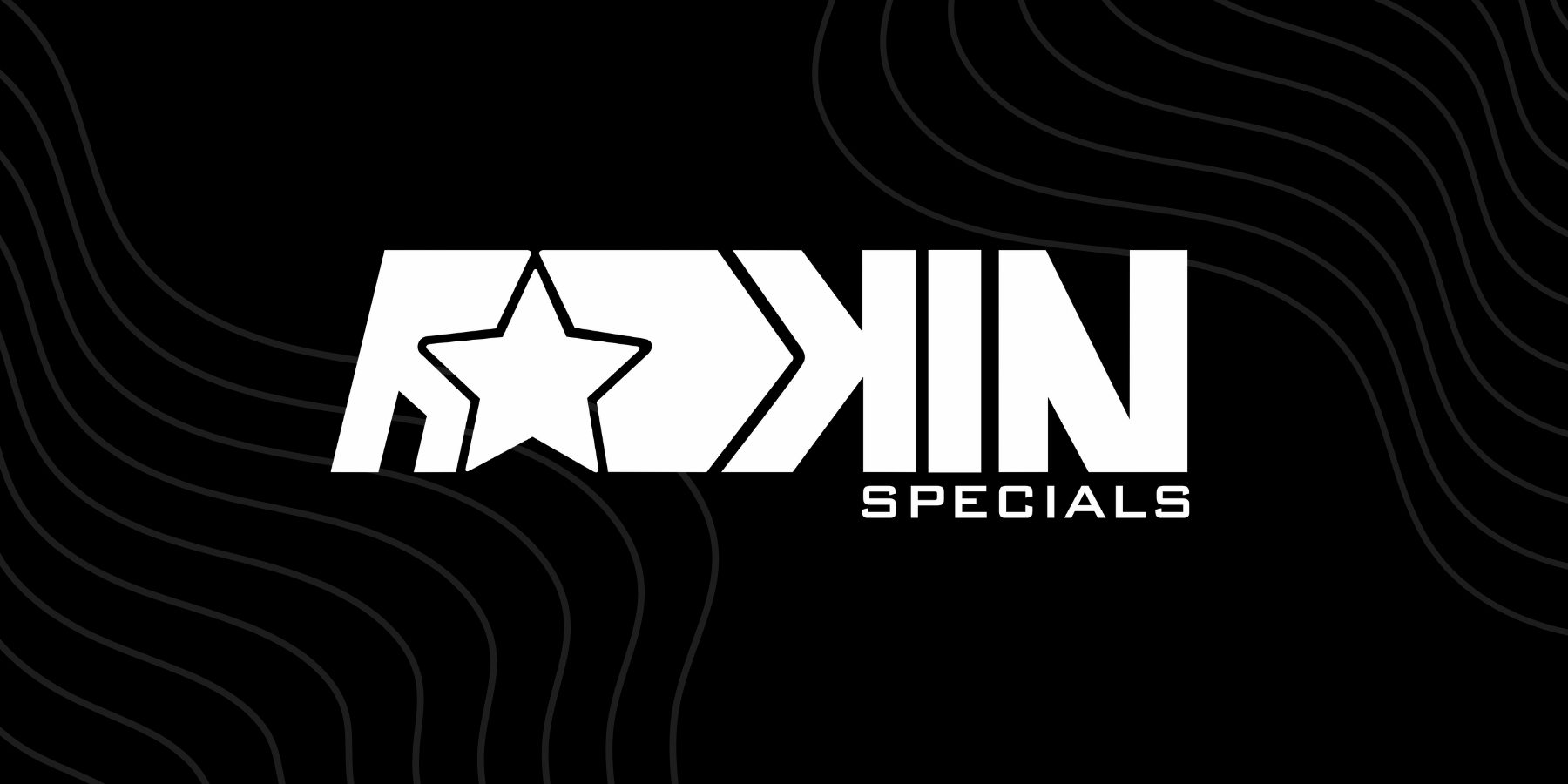
RADKIN Specials
Introducing Radkin Specials – a curated line of limited-edition collections designed for those who seek the extraordinary. Each piece in the Radkin Specials collection embodies our dedication to unique design, artisanal craftsmanship, and refined quality. These limited releases are crafted with exclusive materials and innovative details that set them apart from our core line, offering something truly special for our community of trendsetters and style connoisseurs.
Radkin specials, reserved for those who appreciate rare finds and unforgettable style. Available in limited quantities, these pieces are our invitation to own a slice of Radkin’s finest creativity and vision.
Prepare to experience Radkin specials like never before. This is the wait and see moment, where what’s next is always better than before.

About our Logo
Our logo represents a modern minimalist monogram combining the “R” and “K” of RADKIN in a sharp, intertwined design.
Just as diamonds are unique and valuable, placing a diamond shape in the center of our logo implies that our brand stands out in its field and offers something special.
Three triangles represents our relationships and connections, highlighting radkin values community, collaboration and inclusivity.
A straight line used beneath the “RK” making the logo appear well-organized and contribute to a minimalist aesthetic.


